How to identify distress in the financial system?
The most important indicators outlining the resilience of the financial system from the financial market perspective
Investors all over the world would like to feel comfortable with their investment portfolios at all times. Unfortunately, it is not always possible, especially during times when the financial system is distressed. Luckily, it is achievable to limit potential anxiety if one is aware of what is going on within it and which parts are the least healthy. Having said that, the purpose of this reading is to provide some useful indicators that can help to identify some early signs of distress in the financial system based on different areas in the financial market. This kind of knowledge allows the protection of any investment portfolio as well as the entire wealth.
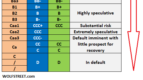
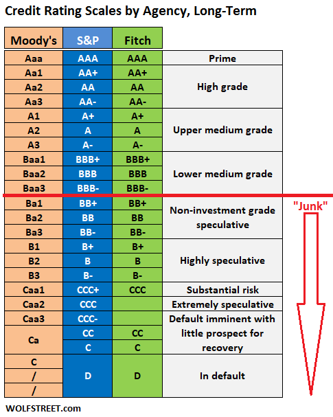
First of all, it is key to be aware of the credit rating scale of bonds and other debt products before analyzing the financial system’s distress indicators. The bond market is the most important market in the world. If any issues such as insolvency appear there then will immediately translate to other sectors of the financial system. Below you can see the table explaining all the credit grades broken down by credit rating agencies: Moody’s, S&P, and Fitch. Above the red line, we have the highest quality debt with the least chance of insolvency, the so-called investment grade or high-quality bonds. Everything below the red line is considered as low-quality or junk, high risk with more probability of default.
Keeping in mind the above scale we can move to the indicators assessing the strength of the financial system.
ICE BofA US Corporate Index Option-Adjusted Spread
This name seems to be complicated. In reality, it is not as much. This indicator measures the difference between US investment-grade corporate bond yields (those starting at BBB and above) using bonds that have the embedded option to be paid out before the maturity date, and the US government bond yields. In essence, this is a spread of bonds interest of the highest quality corporate issuers and the US government. As you can see on the below chart, the lower the spread the more healthy the market is. Larger spikes in this gauge usually coincided with a recession in the past (gray areas). This is because if the spread widens, it usually means that the cost of debt of these firms rises faster than the US government as investors want to be compensated more for taking risks during a turbulent period in the financial system and the economy. Right now, however, things look relatively calm, and the spread is around 1%.
ICE BofA BBB US Corporate Index Option-Adjusted Spread
This indicator is very similar to the first, and the only difference is that it uses bonds of US corporations having BBB credit ratings. This grade is situated just above junk but is still considered a higher quality. It is sometimes useful to differentiate between all high-quality bonds and the ones being on the edge. This is because if any signs of problems appear in high-quality debt it will show up first for companies with BBB ratings. As it is shown below this spread also looks healthy, sitting below 1.5%.
ICE BofA US High Yield Index Option-Adjusted Spread
Lastly when looking at bond spreads it is important to look at companies with the lowest credit rating. This spread will be always the largest and will be the first to spike in case of any trouble in the financial system as these companies’ financial structures are the weakest. Currently, however, the spread has been hovering around 3% and 4% proving that this area of the market is sound and resilient.
ICE BofA BBB US Corporate Index Effective Yield
The next index shows the weighted average bond yield of US corporate bonds of companies with a credit rating of BBB (just above junk). It is sometimes useful to look at yields only but they do not show the entire picture. As you can see, those yields have been rising since late 2021, which has coincided with the Federal Reserve raising interest rates in the US. It is quite difficult to detect any issues if we know that all interest rates have been rising. Therefore, it is better to look at spreads (relatives) and compare corporate bond yields to the US government bonds.
ICE BofA CCC & Lower US High Yield Index Effective Yield
Similarly in this case. This index also shows the yields, but of the companies with the lowest credit grades (CCC and below). Again, if we do not compare it to the safest bonds in the world (US Treasuries) we will not be able to exactly conclude whether there are some serious issues or not, unless it will spike decisively as it was the case in 2008.
iShares iBoxx $ High Yield Corporate Bond ETF (Ticker: HYG) and iShares iBoxx $ Inv Grade Corporate Bond ETF (Ticker: LQD)
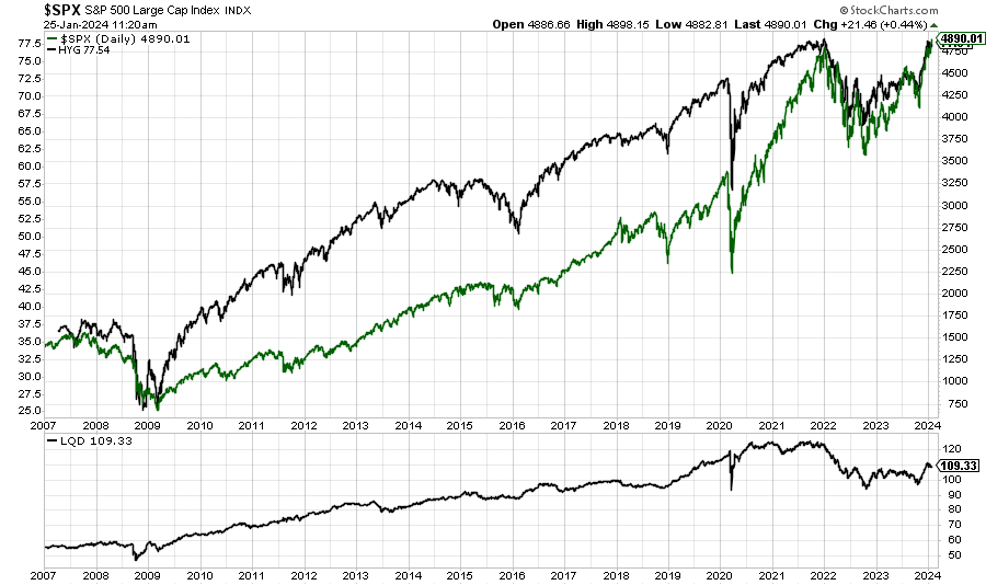
After reviewing investment-grade and non-investment-grade bonds including their yields and spreads it would be also practical to analyze the prices of these financial instruments. The chart below shows the ETF HYG (top part black line) tracking the performance of high-yield (non-investment-grade) corporate bonds in the US, the S&P 500 (top part green line), and ETF LQD (bottom part black line) tracking the performance of investment grade corporate bonds in the US.
Interestingly, over the past 14 years, the S&P 500 has been following the trend of the ETF HYG. Thus, we may sometimes use HYG in trying to predict short-term moves in the S&P 500.
US Equity and Bond Volatility (VIX and MOVE)
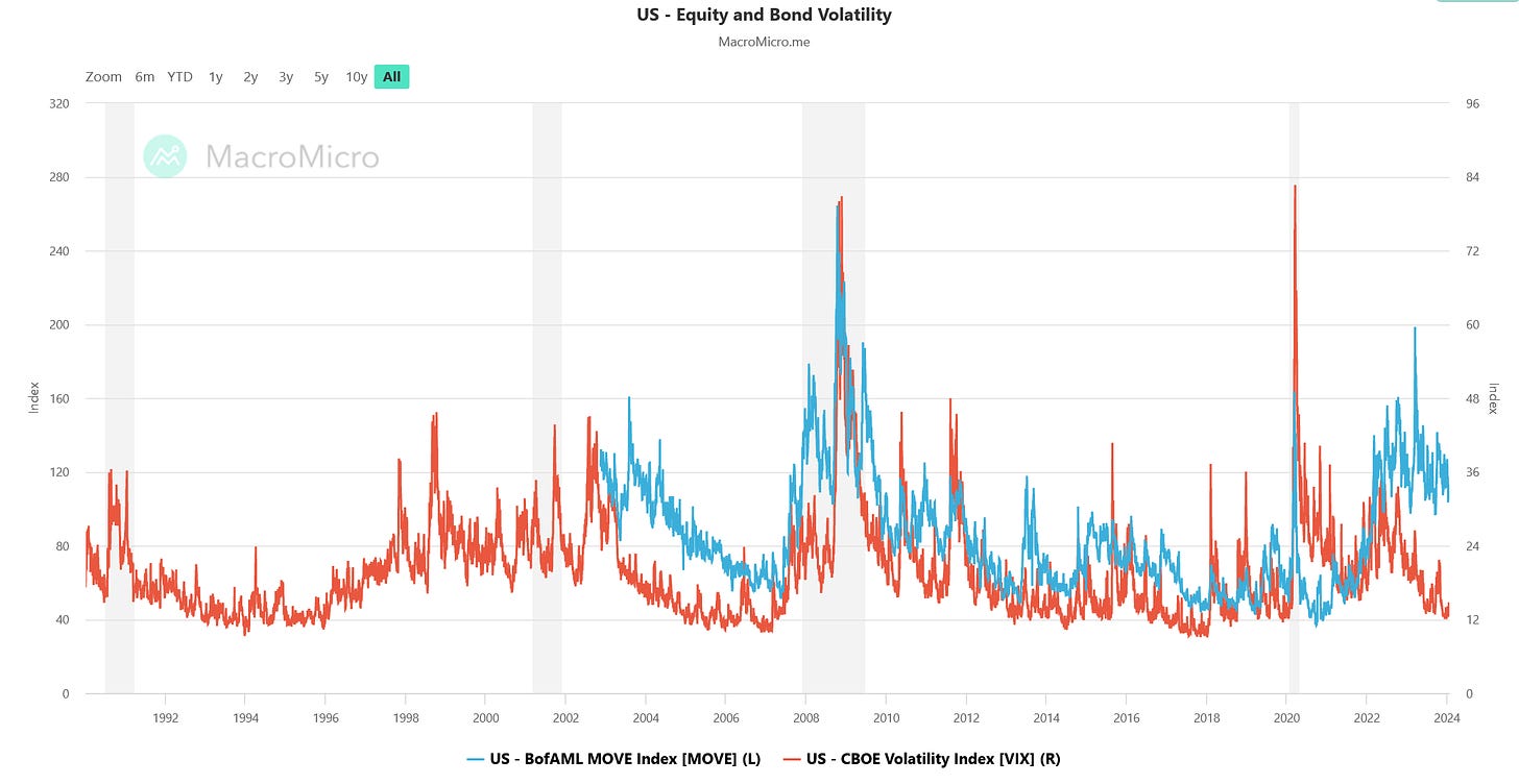
The next indicators are probably the most commonly used by investors. These are stocks and bonds volatility indexes VIX and MOVE. VIX is a real-time market index representing the market’s expectations for volatility over the coming 30 days based on call and put options of the S&P 500. Investors use the index to find out whether the stock market is under stress or to identify how much fear there is in the market. On the other hand, the MOVE index calculates the implied volatility of US government bond options using a weighted average of option prices on Treasury bonds futures across 2, 5, 10, and 30-year maturities. In other words, MOVE measures the volatility of the US government bonds. It shows the overall sentiment of the US bond market. Higher values of the index mean elevated volatility which translates to more risk when investing in Treasuries. Lower values show that investors expect more stable interest rates going forward (less investing risk). The chart below clearly explains that we have been going through a low volatility period in the stock market in recent months and elevated volatility in the bond market over the last two and half years.
In other words, unusually more risk has existed in investing in bonds than in stocks in the recent period. On the flip side, however, it might be a counterintuitive sign and if we believe that some turbulent period may occur then VIX volatility may spike on any adverse news causing stocks to fall while bonds may gain at the same time. Such a market reaction usually takes place during an economic downturn.
St. Louis Fed Financial Stress Index
Last but not least, or even the most important is the St. Louis Fed Financial Stress Index. I think it is the most useful indicator because it uses 18 different variables related to the financial market. Seven of them are different interest rates, six yield spreads, and five other indicators such as stocks and bonds volatility as well as the performance of the US financial sector. A value of the index falling below zero suggests below-average financial market stress is present and above zero shows above-average financial market stress.
We can see that apart from early 2020 and the Great Financial Crisis (2007-2009) the index has also captured a few weeks of early 2023 when in March three regional banks failed in the United States: Silicon Valley Bank (SVB), Silvergate Bank and Signature Bank raising some concerns about the resilience of other regional banks. Those concerns have eased after the Fed established the Bank Term Funding Program (BTFP), providing a backstop for banks and other financial institutions. Currently, the value of the index is -0.8 showing a below-average financial market stress.
CONCLUSION
Following this quick analysis we may all agree that these days there are not any visible signs of distress within the financial system. History shows, however, if any arise they will show up very rapidly. Therefore, every investor and market participant should be mindful of this fact and check the above-mentioned indicators regularly.
If you find it informative and helpful you may consider buying me a coffee and follow me on Twitter:


Great information, thank you.